My more current work was made slightly before I had an enlarger, and its only since I’ve had my enlarger that I learnt a certain quality of negative is needed to print properly, of which I’ve only taken two dozen, and only 2 negatives where really good, damn it.
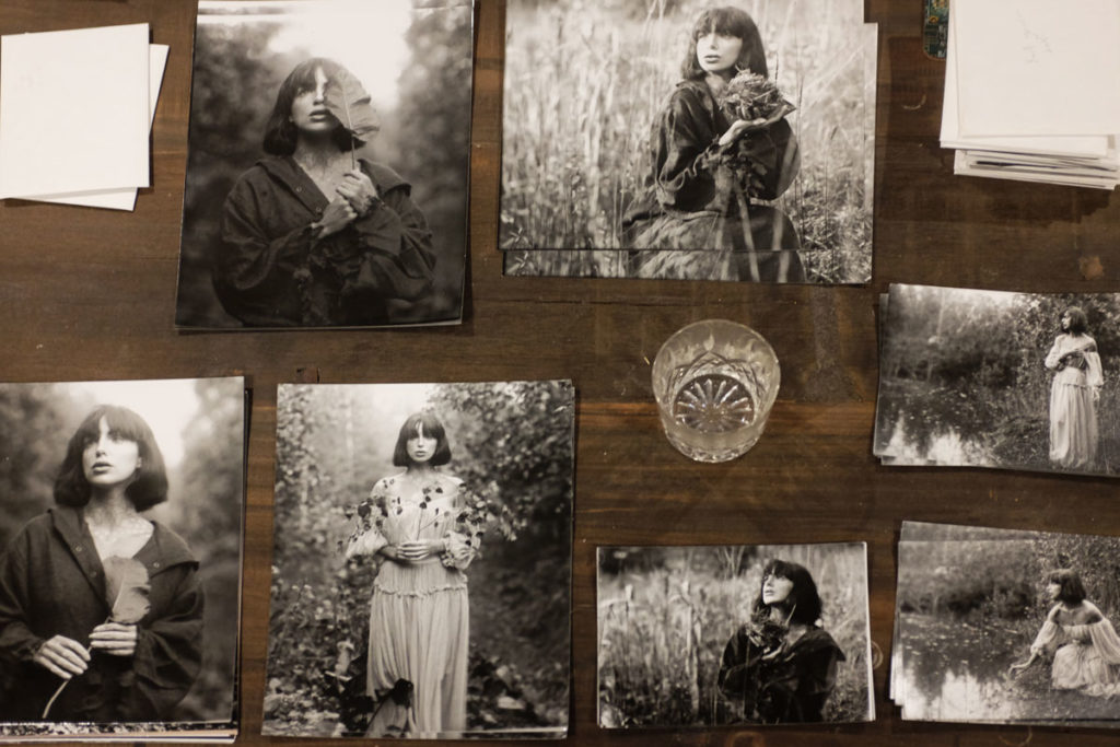
Something has to be done to fix this disaster and I have only one plan. I have read a few times about the 100 prints project. I want to find 100 of my best images and print them all in a cohesive manner. All printed to the best of my ability, toned and matted. For many reasons, this will be a challenge for me! I am not convinced I have 100 printable gelatin dryplates, never mind 100 great negatives. However, I will persevere to print as many as I can over the next few weeks.
]]>Since I started shooting gelatin dry plates I have noticed the contrast is fairly high. Unfortunately I have only recently starting printing with a darkroom enlarger so my awareness of what a perfect negative for printing looks like still needs some fine tuning. I have decided to test each batch of plates to ensure I know what light meter reading to use. Now that Ive started densitometry testing of my GDP’s ive become aware of just how dense and contrasty they actually are.
The first test I made to determine their speed I based upon Ansel Adams film testing procedures. I altered the test so I could get a range of test exposures onto one plate instead of a dozen plates. Technically this isn’t recommended as you create a series of density steps created by multiple exposures but life too short to care. Photosensitive materials may behave differently from 2 one second exposures versus a two second exposure. I took a photograph of a large Lastolite grey card and then placed it onto Zone 1 of Ansel Adams zone system. I then left a part of the plate without exposure to determine the base fog and exposed shots for iso 6,3,2,1.5. I then developed and fixed the plates. After drying I read the densities of these steps with a densitometer. This seemed to suggest my latest batch of plates where ISO 2 with the third step with exposure showing 0.10 density above glass base + fog.
 The image above has been manipulated in Photoshop to clearly show the density steps
Once I had determined my plates where ISO 2 I then took some exposures of the grey card placed on zone 8 and then developed the plate for my usual time. Once processed and dried this plate had a densitometer reading of 2.5 above film base + fog when ideally it should be 1.3, Bollox!. Generally 5 mins is the minimum recommended development time for even development. For the next test I decided to try Hc110 1.5% for 8 mins and 5 mins opting to change dilution instead of a shorter dev. Its recommend that 5ml of HC110 is the minimum recommended volume so I had to use more water than usual to ensure I had the min developer volume. The 8 min development came out at a density reading of 1.9 and 5 mins 1.2. I decided for now 6 mins will probably be good enough estimated ideal dev time. As my testing methodology improves later I am sure I will begin to get more accurate assumptions.
 Checking a plate developed for Zone 8 to see it comes close to a reading of 1.3
After this week of testing I have now started to realise just how super contrasty my negatives where with my old development process. Before going too far and assuming too much it is best to start taking some real world photographs and see how they behave once printed with my enlarger setup. I took some still life images in the garden and sketched out a reference image with zone system reading indicated on the image. I then photographed the scene and checked to see if the corresponding density values matched the spot meter readings obtained.


The exposure I needed was about 2 seconds. Past about 1/2 second reciprocity failure may come into effect. I was once told with exposures above 1 second, double the time. Whilst this seems terribly generalised I decided to do a 4 second exposure too. Its worth pointing out that GDP’s are sensitive to UV light only so the meter readings from a light meter which takes into account the full spectrum of light may not indicate the correct amount of light in pure UV terms. It is possible that a photograph taken in the shade may need more exposure than the meter is indicating versus a meter reading in full sun which may need no compensation.
The prints above where made at 5.5 seconds F16 which is the time it takes to print through a clear glass negative and obtain a maximum black on the paper. The image with the extra exposure on the right corresponds better to the image I had metered. The shadows under the chin of the stone man being where I placed them to be on about zone 4. Im hoping the extra exposure was needed because of recipriority failure and not pointing to the fact my plates may be ISO 1 and not ISO 2 which I calculated in a more technical set of tests.
Going forward I feel my GDP’s are developing too fast and I may need to investigate what’s causing that however for the sake of getting out there and making images I am quite happy to use a dilute developer. My process is developing better images than ever before and I was often very happy with the results these less than ideal plates produced.
]]>
I find this more so even with artists who claim to just follow their own visions and taste. Their book selection seems to oust them and reveal a great breadth of intellectualising has shaped their vision.
I’m not a great intellectual but I’ve read a few books on this subject of beauty. It’s hard, it’s boring, they’re a struggle to read. I can only seem to grasp the essence of it but never fully understand it.
Here’s my understanding.
On an unconscious level we are all coming to terms that the world is chaos, little meaning and order. Images that add order and coherence to this chaos help us to come to terms with this realization.
Images that pull back, reveal even more possible chaos and give shape and coherence to all these elements, giving form to the formless can have greater meaning.
In relation to this argument, artwork that appears to give this unity of form with the *appearance* of effortlessness gives truth to our hope that the world can be beautiful. With trickery or force, once we see it, it breaks the bonds of truth. The world is no longer ordered and beautiful as strain is needed to make it so.
I believe there are exceptions but by and large most great portraits of cultural significance are around 50mm lens and shot at eye level. With an apparent economy of means.

And then finally, form, texture pattern, it’s essentially decoration. Can simple decoration be elevated to the heights of beauty? No matter how hard we abstract our images the reality of their subject matter still exists. When the subject matter deals with the human condition, what it is to be human, its status is elevated.
The subject is just theories, many separate competing theories. It goes deeper, like why some music speaks of great sadness of the human condition but sound is more an abstract form.
On a closing note aesthetic theory has often been shooed away from the artists studio, it can bog you down, cripple your vision with overthinking and self imposed constraints. There’s also many exceptions to disprove the rules. I happen to agree but I never forget, for many a super creative artist out there, I’ve seen their bookshelf and they’ve read about it at least and come to terms with it in their own way.
]]>Often when working with models they know how to come alive. Before you know it they’re pulling of beautiful poses. The more creative models will start freestyling doing all kinds of unexpected contortions. You can create the most unique set of images but when it’s time to place them into a personal body of work, they rarely find a place.
On the other spectrum, where the model waits awkwardly for input, often a feeling remains this awkwardness. When you do start to direct them, the question is, direct them to do what exactly? Often the most successful approach might be bluntly summarised by saying “stand there and look pretty.”
Try as hard as you like to play around with the traditional portrait whilst using models, it’s hard to create something that looks genuine, unstaged, says something about the creator and becomes a part of a coherent body of work.
I find myself unbalanced between being a straight photographer who captures models how they present themselves yet desperately trying to introduce something of the conceptual without actually knowing what that element is. My personal aesthetic isn’t digital art, it’s mainly the creativity that seeps out when restricted by straight photography’s limitations. Whilst uncertain of many things, I take comfort in this solid aspect of my personal style.
An influence I’ve recently stumbled upon is the Danish painter Hammershoi. A large element of his work is about interiors and their space. From experience I know this isn’t going to be an element of my work. There is something very special of many an old interior space which you will struggle to find today.
His compositions are very simple yet sublime, almost blocky. I get a strong affinity to Whistler who he must of drawn inspiration. His use of light and space is very delicate. His backgrounds and props are simple and domestic in nature.
Many of Hammershoi’s paintings make me question if they are even portraits. My favourite images are of his models facing away. His figures seem to become building blocks of an overall composition that may not even be about them, but somehow you end up pondering upon their personality.
When I first saw a Hammershoi I was gripped by a strange feeling that I was somehow dead, or they where dead. Never have I felt this strange outer-body like experience when viewing an image. I feel like I’m peering though some “other dimension” bodiless and non existent.
Perhaps the inhabitants of the painting are dead, now just a recording of themselves played back through time and only seen by those gifted in spiritual matters on lonely dark nights. Try as you like to get their attention, they carry on with their silent chores uninterrupted.
The people in his spaces are just existing, being in the moment. Completely unaware and often facing away. There is no hint of an artist standing out of shot giving them directions. Never have I seen figures so egoless. It’s hard to class them as portraits although candid images seems so hopelessly inadequate a description.
The artists skill is making the commonplace sublime. The simplest of elements, doorways, an empty stool, picture frames. People engaged in the simplest of domestic chores and just being. A feeling of stillness and silence. A silence so strong it feels like a protest.
]]>I remain open to somebody demonstrating to me how flash can get the results I want but Im not even sure its technically possible to get it to work with vintage cameras, very slow shutter speeds and an emulsion that doesn’t quite see light the same way as modern film.
The problem I often run into especially with Gelatin Dryplates is that working with overcast often isn’t always quite the magical a light as some photography teaching books indicate. Sometimes it is just plain crap. Very overcast lighting also needs slower shutter speeds thus more blurry models. Your range of poses and shoot locations becomes more limited.
A problem more specific to older emulsions that the clouds really light the top of the head but the UV light in the shadows is drastically lower. It is extremely hard to avoid deep shadows under the eyes even with the softest of overcast light.
I recently watched a Field In England. I absolutely fell in love with its melancholy overcast light, its dreary English field and beautiful B&W. I tried my best to find out how they filmed it to try and get some tips. I read they only used one LED light panel, this was a seriously budget film masterpiece. Annoyingly I have no idea what LED light panel and there is a whole magical kingdom out there of video LED lighting that is so professional, even WEX don’t sell it and nobody has ever heard of it.
Feeling inspired by the fact they created such an amazing feel with overcast and an LED light panel I decided to give it a go myself. I ended up with an Aputure LED light that wasn’t a panel light. My theory was I could use modifiers to soften it if needed.

The photograph above was shot with a large pop up reflector positioned out of shot at the top right of the image. The reflector was silver side facing the model and the Aputure LED was shot into it at full power. The effect looks quite convincing and the light soft.
As I only had one reflector I did not have another reflector to bounce any light back into the left although the emulsion seems to of just got enough shadow detail to satisfy my tastes. I was worried the light would not register quite as strong on a gelatin plate as it appeared to the eye but it looks like it easily did the job. Any more light and I might of blown some detail out.
A good detail about this pose is that Anna Mays face is looking up which gives the best conditions for overhead lighting to light the face with a lot less chance of getting deep eye sockets due to shadows.

The above image wasn’t quite as successful although I still feel its a nice portrait. In this image I wanted to try and give quite a big POP to natural lighting but the results a bit overkill. The Aputure light is just behind the model to the image left. Its shining straight into her neck area. There is also a reflector at image right providing fill.
After developing the image I now realise that I need to be more careful with this lighting technique. I think it works best when accent lights are just a slither of strong light. In this image her whole cheek is overblown and her right arm looks a bit odd. Ive a feeling I used the silver side of the reflector and there is some confused lighting direction issues happening.
I feel the lighting of the jumper against the darker foliage works really well and I might like to experiment with that concept more. Where the cheek is strongly lit against a fairly light face and bright sky it seems to lack the same impact as a slither of bright light surrounded by darker tones.
As the LED light was used more as an accent light it also didn’t help too much in brighting the overall scene up and the shutter speed was a little low which resulted in a slight motion blur. I feel the reflector may possiblly of been better placed to try and bounce more light back into her face only.
One thing that I love about this image is the models hair, I think she really saved this image with such a nice pose.

This image has turned out almost exactly as I wanted. The accent light is perhaps covers slightly too much of her cheek but I wanted a dramatic almost blown out amount of power. This image also seems to work better than the previous image as the accent light is also framed by a darker background. The right sleeve is sublime. The light has also caused some flare in the lens which isn’t always desirable.
The image is a bit soft and Im starting to feel I really need to increase the film speed of my emulsion next year. Im currently about ISO 2 bit it often helps to give and extra half stop so its always an issue having a bit of motion blur. I don’t feel like I’ve really mastered slower emulsions but there may be a few things I can try to attempt to get closer to ISO 3 without going too technical.
]]>